Showing posts with label multiple photos. Show all posts

September 10, 2015

Labor Day weekend crafting--

I did have a chance to do some scrapping over the Labor Day three day weekend; here's my latest scrapbook layout, using the walk in the woods photos from a couple posts ago. You can either just scroll through and admire the photos (click for larger) or you can read the text, where I explain a bit about my process of making the layout.


I had about half again as many photos printed, but I just couldn't get them arranged the way I wanted, so I had to make some editing decisions-- I took out the ones that were too similar, and a couple that just didn't make my cut from a photo design / color perspective. I decided to feature all the close-up photos on one page, and chose two of the 'regular' photos of the woods to use on the other page. I had originally cropped all of them in rectangles and squares with straight edges, but I ended up not liking how that looked so I got out my old-school circle cutter and my corner rounder. 

I think cutting the raspberry and thistle photos in a circle echoes the shape in the photo, and the rounded edges on the rest of the photos softens the lines and makes it a bit more relaxed or organic feeling. (hopefully? that's what I was going for, anyway, lol.)

Below is the left-hand page:


This page is based on a Scrapbook Generation 1-page sketch, with a few changes. The papers I chose are actually a mix of papers-- some from a Pink Paislee Christmas paper pad (the large polka dot, the green horizontal strip, and the blue zig-zag) and some other papers from my stash. I don't scrap Christmas or winter pages very often, but when I saw that paper pad in the store, I knew most of the patterns would be good for 'regular' pages, too!

The next photo is the right-hand page (sorry for the bit of glare from the upper left photo):


I extended the one-page design across the two-page spread by doing the 'opposite' background paper arrangement on the right-hand page. One other small detail- I decided to ink the edges of all the papers to get rid of the white edges and make them blend a bit more with the darker cardstock background. It was time consuming, but I think it was a good decision.

bottom right embellishment cluster: cork circle, enamel dots,
vellum phrase, decorative brad, pink sticker, and a stamped word.
Once I get all the background papers and photos attached, I start looking for embellishments for the pages. (this post shows a picture of the 12x12 Iris cases that hold all my embellishments- tags, brads, enamel dots, stickers, and all sorts of rhinestones, wood veneer shapes, etc.) Page embellishments are little bits and pieces that (hopefully) lead your eye through the layout and reinforce the shapes and colors on the page and in the photos.  

the title embellishment cluster: more cork, wood veneer
camera, gold brad, layered paper, vellum phrase, a bit of
pink, more enamel dots, and another stamped /cut-out word. 

left-hand embellishment cluster- the same combination of
items: brad, cork, enamel dots, stamped word, stripes, and 
blue, pink (in the brad), and gold,  which I used in each area. 

Choosing embellishments and deciding how to arrange them is a slow process for me, but it's also kind of fun-- looking through my Iris boxes to see what jumps out at me that could be used on the page, and deciding how to arrange the small items to emphasize colors in the photos and on the page. I decided to use pink in the embellishments so the raspberry photo wouldn't look so out-of-place, since otherwise it's the only pink on the page.

Embellishment clusters sort of 'lead' your eye across the layout, too, so I laid them out in a 'visual triangle' arrangement-- since we read from left to right, your eye goes from the lower left up to the title, then across to the right-hand page to the pink in the raspberry photo and down to the lower right-hand corner. (again, that's what I was going for, anyway!) And, even though it took a lot of effort and arranging on my part, the result I was trying for was a loose, collage-style layered look. (I just need to be a bit more decisive to make the process go quicker.)

Oh-- and after all that was on the page?? That was when I decided to add all the gold splatters with Heidi Swapp colorshine spray. I had to cover up the photos and embellishment clusters so I wouldn't get gold splatters all over everything. This is definitely a design decision better done at the beginning, for sure!! 

And now, a switch from scrapbooking to card-making-- which I don't do all that often any more. I made four altogether, but can only show you one right now, since the other ones are on their way to people who I know read my blog, lol!

it's five layers total, not counting the card base (which is not
nearly so bright in real life... my phone camera didn't capture
the color correctly, and I couldn't edit it back to the true color.)
I pulled some tags, die-cuts, and other things from my stash, and started layering things together just to see what worked. 

The butterfly is stapled to the pink tag, and everything else is glued / tucked underneath on the round journaling tag. The glitter on the butterfly wings was supposed to just be polka dots, but-- me and glitter glue? not a good mix-- so after a bit of a glitter glue accident, I had to cover up the evidence by outlining the entire thing. 

I have a slight obsession with tiny alphabet stamps (I only own 5 or 6 sets of them so far, lol!) so I used one of them to stamp the 'hello' on the blue banner. 

I hope the recipient likes it! 

I have a 12-hour SB store crop coming up in October, and at the end of September I'm going to the Scrapbook Expo in Mesa-- I haven't attended one of those in years. I'm taking two classes, as well as attending a 16-hour crop, so I'd better get busy editing and printing photos, and designing layouts! :D

February 11, 2014

my other 12-hour crop pages

Here's photos of the other pages I worked on during the 12-hour crop on Saturday; I didn't think I had that many photos, till I started selecting them-- I'll try not to write so much to hopefully keep the post a bit shorter! 

Here's my Christmas 2013 collage page- we didn't put up any Christmas decorations to speak of, partly because of Zola (kittens + trees + glass ornaments = a disaster in the making!), and partly because there was so little time between Christmas and Thanksgiving. I did get out a couple small decorations, so this page is going to be titled 'a small Christmas.' (the crocheted tree reminds me of crocheted decorations my Grandma made, and the lighted ceramic tree is from Tom's Great-Aunt Marie, if I remember correctly.) The rest of the page is a mosaic composed of various pieces cut from the Christmas cards we received. (I always wonder what to do with the cards once Christmas is over, and this was a good way to keep them by saving 'parts' of them.) I did keep a couple cards whole; they'll get put into a regular 8.5x11 sleeve in the album next to this page.

a detail shot- hexagons are 'trendy' right now, so I thought it would be fun to use my hexagon punches to cut bits out of the card fronts. These particular ones are vellum (punched from part of my sister Judy's handmade card), and are attached using metal brads.
 Again, this layout was inspired by a scrapbook layout I came across on the internet and had pinned for safe-keeping. Mine turned out quite a bit different, but I love that I'm actually using some of them to make things from instead of just pinning more and more! (click here to see the inspiration layout, if you're interested.) 

This next layout was alot of fun to make, and turned out pretty much how I envisioned it would- do you know that feeling, when you know your project is working just like you wanted? I don't have that feeling very often when I craft (sometimes my projects seem to have a mind of their own and take a turn I don't expect), but I had that feeling when I made this one! 
the letters for this page were cut using my Cameo- the font is one I downloaded from the internet, called Airstream. (and yes, I can spell: I just need to cut another exclamation point,
because I lost the 'dot' that went with this one- lol!)
It's a fun, light-hearted subject, but one I knew I wanted to make a layout for. Tom and I both love authentic Chicago-style hot dogs, so when we heard they were building a Portillo's here in the Valley (finally!), we knew we had to go. The decor, the food, and the service were all top-notch, just like we remember from 'back home' in Illinois. I tried to capture that 'vintage diner' feeling of the place with the page layout (which is based on another Scrapbook Generation sketch). The journaling will go in the open space under the photo on the right-hand page, probably typed on a tag or on strips of white cardstock.

Somewhere along the way, I found a piece of scrapbook paper that I knew would be perfect for this layout; the paper design was all diner-style signs, which I cut out and put in that vertical area of embellishments. And the 'hot dog' is the Portillo's logo, which I cut from one of the paper bags our lunch came in! (They will ship their food all over the country, in case you're interested- lol!) 

The (somewhat obvious) page title is letters I cut with my Silhouette Cameo-
the font is one I purchased from their online store, called LD Brown Nose.
It's nice and casual, and I think I'll get a lot of use out of it. 
This layout is one I'm glad I finally got to work on- we did this hike back in early April, 2007!! I'm not a hiker at all (my idea of hiking is strolling through the preserve looking at birds, after all), so this is the first and only actual 'hike' I've been on since we've lived here. It was beautiful and impressive scenery, though, so I am glad we did it. (Only Tom managed the last bit to the very top; I wimped out right at the very end where you had to pull yourself up by cables using pretty much just your arm strength.) Oh, and I also got bitten by that cute squirrel you see, there, too- I need to add another page to this layout to explain that, and to add in the rest of the pictures I chose to include. (I also need to add some embellishments to this layout- with just paper, it looks a bit 'flat' to me, especially looking at it in a photograph.)

This shows the rest of the pictures I still want to include, along with scraps of the papers I used and a piece of coordinating cardstock. It's stored in a bag with the rest of the layout for now, till everything is finished. (I want to keep it all together so I don't accidentally use the patterned paper for some other project!)

And here's an example of a page kit I put together for some photos I didn't get to work on Saturday- but the papers and extras are all together in a gigantic zipper bag, so when I do have the time (and the inspiration) it will be a bit easier to get started. The photos are from a day I when visited the Arizona state Capitol in downtown Phoenix. I never got to visit the Illinois state capitol building when I lived there (Springfield isn't exactly next door to the Chicago suburbs, and I just never got around to traveling down there), so I really wanted to visit the Capitol here since we live so close. (It was pretty neat; I'll show some of the actual photos from the trip in a separate post.) 

Since it's the state capitol building (I'm not sure: are you supposed to capitalize 'Capitol' when you write it?), I chose some red, white, and blue papers, along with some more 'Western-type' papers like the denim patterned paper that I think is a photograph of real denim fabric, with actual sewing on the paper. Not sure which of these I'll use when I make the layouts, but they're all together, so they're easier to get to and part of the decision making is done already. 

One more photograph, that probably only another scrapbooker would 'get' my fascination with, lol! The dome of the Arizona Capitol building is covered in copper, and since copper- and mining in general- is an important part of Arizona state history, I included these two specialty papers in my page kit. It was tough to get a good picture of them, but both of these papers are metallic sheen to them, and the one has a brushed-metal feel to the actual texture of the paper. I don't know how I'll use them exactly, but I definitely will try to get at least one of them in there somehow! 

(apparently I don't know how NOT to be wordy... thanks for reading, if you made it this far- lol!)


April 15, 2013

cactus nursery- 2 page SB layout (it's finally done!!)

whew!! This layout has been sitting on my workspace for a couple weeks now, and staring at me whenever I wanted to work on something else. (I started it back in this post, if you want a refresher.) So, tonight I finally decided it was time. I only needed to complete the journaling, but I was having a bit of a mental block about doing it for some reason. First I thought I'd hand-write it, but I decided I had too much to say (which is quite often the case, with me, lol!) so I went for the typewriter. Here it is:

sorry for the glare, but I didn't want to wait
till tomorrow to take the photos of it, lol!

I typed the text on a piece of plain ivory cardstock, then cut the pieces apart with my trimmer. I had to get creative with my cutting to get everything I wanted to say in the space, and make it look neat, without creating too many places where there was 'trapped white space' to make it look strange. Journaling like this takes a bit of time (to get everything typed and spaced right), but I like how it turned out.


LEFT

RIGHT

close-up #1: a re-styled flower embellishment

close-up #2: second re-styled flower embellishment

It's not my favorite layout in the world, but it's finally done, and I like it. I still think I'm going to print more photos from that trip and make another layout, but this one is in the can (so to speak, lol!). 

February 17, 2013

my last scrapbook layout make-over

Like I said before, I don't want to make a habit of 're-doing' scrapbook layouts that I've previously done... styles change, trends come and go, and techniques may fall out of favor over time, but that's part of the way any hobby or someone's personal style changes and evolves over time. But... I recently came upon this layout when I was organizing and cleaning my room, and I decided I just had to re-do this one:

I don't even have the album it came out of... it's long gone, and I don't think I ever even made any other layouts on these kraft-colored papers. Plus, they're strap-hinge pages, and I don't even use that type of book any more. And, c'mon, look at it! I mean, really!! I wrote the title in using marker! (and badly, at that!! lol!!) So, I used my trusty bottle of Un-Do, removed the photographs, and re-made the layout using using more current scrapbooking papers, tools, and techniques. Check it out below:

I think the colors and papers I chose highlighted the photos and the subject matter much better than the kraft-colored cardstock the layout was on previously did, don't you?? Plus, really, there wasn't much of a design to that layout, at all-- just a couple of sad little flower stickers on some 'blah' colored cardstock. (It was kind of embarrassing to look at that layout, actually- especially the badly done lettering. I felt no remorse whatsoever as I took it apart!)

I used a good mix of old and new supplies here... the letter stickers are new (last week), and the floral paper is at least 12 years old... nice, huh?? See what happens when you organize your space?? (that's a pep talk for me, actually-- to remind myself that when things are organized, I can actually find my stuff to use it!) The tiny little pennant punch is only about a month old, and the vellum I used for punching the pennants and butterflies was at least 10 years old. Let me tell you, it feels good to actually use my supplies to make scrapbook pages!!

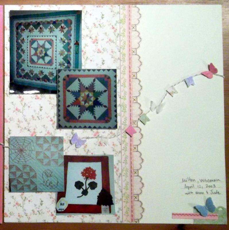
I used all the photos but one... I decided the leaf photo, while it was a good representation of the quilt show, didn't match the rest of the photos-- it was a totally different color than the rest of the pictures, and the only one that wasn't rectangular or square. So, out it went... and again, I didn't feel bad about it at all. (like I've said before, the fact that I take sooo many digital photos now means I'm better about actually choosing only the ones that I like the best, or capture and event / moment the best. Photos aren't nearly as 'precious' as I used to make them out to be when a roll of film was only 24 photos, and cost $$ to print the bad ones along with the good.) 

I added a couple repeating motifs across the pages to 'draw' your eye across the page, including the green scallop, the different pinks, and the butterflies. These blue butterflies looked a bit plain by themselves, so I actually stitched them to the page with cream-colored crafting floss for a bit of added detailing to catch your eye.

I used a scrapbook layout sketch from Scrapbook Generations sketch book #8, which showed a line of embellishments flowing across both the pages. (in the book, it was stars, but I changed it to this string of pennants and butterflies using tan and white baker's twine.) I don't know why I have to have ideas that cause me such inordinate amounts of 'fiddling' and messing around with things- this layout took me at least a week to do (off and on) from start to finish, and the string of pennants took at least 2 hours all by itself, to get all the pieces situated and adhered the way I wanted. But, I do think it was worth it! I added a bit of beige gingham ribbon, and a line of hand-stitching as well, to reinforce the 'sewing' theme of the photos.

 This meandering line of butterflies and pennants turned out quite nice, in the end. The above photo shows more details-- the scalloped border is printed paper, but looks like sewing, as well- more sewing to reinforce the theme, without any more work. although now that I think about it, I could actually sew over those cross-stitches, maybe... hmmm...?? No, I'm not going to do it! I need to decide that when I think a layout is done, I should quit, and leave it alone. 

One more time, here's the 'before layout' above, and the 'after' layout below-- it's so much better now, I can't even begin to describe how much happier it makes me to see it like this!

Now I think I'm really done with re-doing already scrapped layouts, and doing scrapbooking makeovers... it's time to move on to actually scrapping some new photos for a change! (or some 'old' photos, whichever it happens to be- I have plenty that fall into both of those categories!)