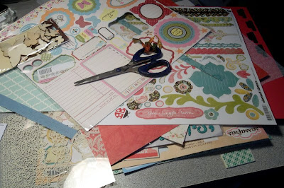
amid the clutter and chaos that is my normal manner of working on a craft project! I was trying for the 'artsy, messy' style of scrapping that's popular right now, where you add freehand-cut layers of matting underneath your photos, maybe some misting or splatters of color and ink on the background page, things like that:
Turns out that no matter how hard I tried, I just can't do the 'messy layered' look... it just isn't comfortable for me, design-wise. I can't do things 'crooked and freestyle' at all; I have to have things lined up, and straight on my pages. So, instead of 'messy layers' on my page, all I got was a messy scrapping space on my desk!
Seems I can't narrow down the choices when making a page without having lots of options to choose from... nor can I decide on a color scheme, apparently, since there's blues, purples, red, pinks, greens, and yellows in the discard pile! And, you can't tell this by the photos, but I don't work very fast, either-- I have to sort of 'ruminate' on my decisions for a while, from the very start of the page. I technically started the planning process for this page a week or so ago, when I tried out a new color of spray ink. From there, I made two changes in what photos to use on the page, and last night I worked for over two hours on the bulk of the actual 'page design' to crop and mat the photos and design the actual 'page' itself. So, without further ado, here it is!
 |
| old-fashioned flowers are the best kind. |
I really love this page, even more now that I'm seeing it in the photograph, I think!! (That's a good thing- sometimes I'm not so happy with them after seeing them photographed!) These two pictures are about 10-12 years old, and are of the flowers in my garden back in Illinois. The background is pink spray mist along with some gold ink splatters, which I think turned out really nice, if I do say so myself! (that's one of those techniques I really haven't mastered yet, so it's sort of like gambling to try it, for me... you don't always know what you're going to get.)
This photo is a close-up of the upper left area of the page- it shows how I mix 'new and old' materials on my pages. I'm not consciously trying to do that, or anything- it just happens! The wood veneer butterfly is new (and trendy), the chipboard letter stickers are new (picked up at a clearance store, for a fabulous price!), the blue background papers are at least a year old (from my local scrapbook store's garage sale), and both the green paper that I used to mat the photos and the pink vellum in the background are from my stash (and both of them are at least 10 years old).
This photo shows the lower right area of the page: another wood veneer butterfly (they're just so cute!), and a bit of a screen-printed transparency. I wasn't originally going to use that transparency on this page, but it was laying in the discard pile next to the page, and I decided it would add an extra bit of 'dimension' to the page. I guess this goes to show that some good design accidents can happen out of the chaotic way I work! (this photo also shows a bit of the gold color shine splatters, though the photos don't do it justice at all... trust me, this gold is beautiful, and if you don't have any of it in your stash, go to Michael's right now-- it's by Heidi Swapp, and it's buy one, get one 50% off!)


2 comments:
That is a GORGEOUS page! I work best amongst chaos.
Thanks for stopping by my blog.
I work in very much the same way as you...when I went to my Blogger's Scrapbooking weekend, I achieved very little as I didn't have all my stash with me!! Love the finished result!
Alison xx
Post a Comment