 |
| pink and purple |
an unfinished 2-page spread in my 5x7 journal: watercolors, a bit of stamping with gesso and teal StazOn ink, along with some collaged paper and images.
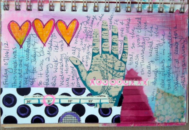 |
| hearts and hand |
a one-page horizontal spread in the 5x7 journal. (I have to remember that even though the book is bound vertically, I can still rotate it to make a horizontal page if I want.) Watercolored background with collaged paper. The palmistry hand is a Tim Holtz stamp that I stamped onto vintage paper with teal StazOn (permanent) ink then cut out, and the hearts are stamped on the background then colored in with Sakura glaze pens. I think it might look a bit better if the hand was outlined with a black pen or pencil, but I'm not going to worry about it too much.

An unfinished page in the 5x7 journal. This page was sort of an 'experiment' in ink use. I have a number of stamp pad re-inkers (small bottles of ink that you can use to rejuvenate a stamp pad), and I wanted to see if I could use them to create a page background, similar to using the spray ink or cake watercolors. I saturated the paper with water, then dripped the re-inkers onto the page, to see what would happen. The drops of butterscotch color sort of 'bloomed' into a really cool pattern once they hit the wet paper. The green ink was more of a 'line' that I drew with the dropper tip, then it spread into the water. (I do like how this turned out, but I had to get the paper sooo wet to get it to work that I probably won't be doing this again anytime soon.)
 |
| lines and colors |
Another unfinished 2-pages in the 5x7 journal. These pages were started out with the black stamping, then I scraped a bit of gesso onto the page (the whitish, lighter spots). Eventually I hit it with the spray inks in a random pattern to create the colored background you see here. (the gesso acts as a sort of resist or the color, so the color isn't as saturated in those spots.)
 |
| boy and his dog |
A somewhat simpler page than some, with various 'blobs' (do you like that technical term?!? lol!!) of watercolor paint overlapping for the background. The image is a vintage photograph that I bought somewhere, scanned and printed onto regular paper. I wrote around the photograph with a fine-point pen. I really like the contrast of the brightly colored background with the vintage black & white image, and not every page needs lots of layers, time, or a detailed, polished finish. (not that I don't like doing that sometimes, just not all the time- lol!)
1 comment:
WOW~ love it! What a neat idea!
Post a Comment