so, last night I made a scrapbook page. (sort of.) Last spring, I started taking a scrapbooking class offered on the website 2 Peas in a Bucket... I made a couple layouts, one of which I never really liked, but I couldn't really figure out why. Here it is below:
 |
| Flower Garden: before (the colors are a bit off, since I took it with the flash.) |
I spent quite a bit of time yesterday afternoon thinking about this, and last evening I sort of gave myself a 'do-over' on this page to see if I could improve it. I didn't start over from scratch, but I did add a number of elements to the page. I used quite a bit of Un-Do to get the title stickers unstuck so I could rework the title (thank goodness for Un-Do; I love that stuff!!) by adding a paper doily behind the title stickers, rearranged the border section a tiny bit, and added some buttons as embellishments.
The re-done page is below:
 |
| Flower Garden- after |
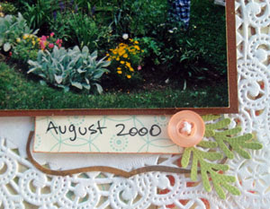
Above and below are a couple close-ups showing the added embellishments pink button flowers, with leaves I punched from green cardstock. I added white crafting floss to the flowers (I tied it in the back) and glued them to the page. I don't like the look of buttons without thread through the holes; it just bothers me... so, even though it takes a bit longer, I usually add the thread. (Plus, that way I didn't have to punch holes in my layout to actually sew the buttons on.)
Usually when people say 'I don't like my pages and I want to re-do them' my first instinct is to say no, don't do it. And I don't think I'd ever take a page totally apart and start from scratch (although I'm not sure, now- I guess I should never say never, right?). But, I think in this particular case, my changes are quite an improvement. What do you think??
I have another layout sitting on my desk right now that I never did quite finish... it's a 2-page spread that's missing some of the design details that make a layout interesting, so it's getting a makeover next! (and then, maybe my room will be cleaned up enough to make a scrapbook page from scratch; we'll see!)


3 comments:
I like your changes. The doily adds great contrast to your title - it now grabs my eye and leads me to explore the details of your layout.
Thanks for taking the time to explain your thought process behind the changes.
What a difference design understanding makes! The re-do is very good! What I like is that you tweaked it because of what you learned, not because the original materials weren't trendy enough.
Post a Comment