Showing posts with label ArtFest. Show all posts

May 12, 2012

NSD 2012 (3rd installment)

And now, for something totally different... I switch gears from vintage inspired heirloom possessions to bright colors and doodling! 

but first: my Mom did say she remembers at least trying to make cookies with the springerle rolling pin... "They could have been used for building brick though. Anise flavored and very hard, at least the ones we tried were." (And that's why I only use the rolling pin as a decoration- lol!) Although it might be interesting to try as an experiment. I think I read somewhere that springerle cookies were sometimes used as Christmas tree ornaments; I guess if that's the case, it wouldn't matter if they were hard or not.  

So, now, back to the scrapbook pages. All weekend long, the scrapbooking website Two Peas in a Bucket- yes, I know- don't ask me where the name comes from; that's just what they call it, lol!!  Anyway, all weekend long they hosted special events and challenges for National Scrapbooking Day on their message boards. My "Fresh" layout fit the criteria for one of the challenges (altering the chipboard dresses and and the picket fence), and I wanted to complete some more of the challenges.  This layout meets the criteria for 'bright colors,' don't you think??
I showed these photos on the blog before, but I hadn't scrapbooked them yet. I know they're not technically 'good' photos, since they're blurry, but I think the blurriness capture the feeling of movement I really wanted to use them to record the memory of Bisbee and Prescott having such a good time playing in the backyard. This layout was made for the challenge 'Bright Colors' and I think it delivers. It's a double-page layout (meaning the pages will stay together like this in my album) made up of one 6x12 page that holds the long, epic title, and the 12x12 page that holds the photographs. The paper is from the American Crafts Amy Tan Sketchbook collection, and it works perfectly for the fun, playful feeling I was going for with these pages. It has multicolored watercolor-look backgrounds, coupled with black or white doodling, and a very hand-drawn feel. I got this paper in a variety pack purchased at the most recent scrapbook store yard sale, I think-I would never have bought this paper on my own, but I quite like how it turned out here.  
The long, epic title on the lefthand page was all done to be tongue-in-cheek; this is not a 'serious' scrapbook layout at all. The title was made using my vintage typewriter, and practically every set of small letter stickers I own, along with a couple mini alpha stamp sets, with teal blue, cactus green, mustard, orange, and black ink. It took about 2 1/2 hours to actually do (why do I do that to myself?!? lol!) but I really like how it turned out.
The journaling/title reads: "Throughout history, there have been stories of pursuit- epic tales of glory, thrilling tales of the hunter and the hunted... Aesop's Fox and the Grapes; Jason and the Golden Fleece; Sylvester and Tweety Bird; Wile E. Coyote and the Roadrunner. and now, there is: Prescott and Bisbee"  haha!! They spend sooo much time chasing each other, running crazily around and around the backyard, and every once in a while, one will 'let' the other one win. (except Bisbee cheats sometimes; she hides behind things, or plops herself down on the grass, to get a break and catch her breath- lol!!)
I added in a couple strips of another patterned paper (the hearts) to bridge both pages, but other than that, I didn't really add anything (didn't need to!) This is one of those layouts I'm really glad I have completed, and I'm sure I'll be glad to look back on it once it's in my album.
One last layout I started on Sunday afternoon, before I had to pack up all my crap stuff and head back home. Another one for the 'bright colors' challenge at the 2peas website! This layout also fit the criteria for a 'chevron' challenge as well, (the huge blue floral chevrons I added next to the title) and a third one called 'the final stretch' since I've had these photos printed for months, and never got around to actually doing anything with them.  The photos are from my trip last year to Artfest, and don't fit any theme or anything, so I felt pretty comfortable just choosing random paper and colors to put with them. (some people might think the paper overwhelms the photos, and yeah, maybe it does from a purely 'design' standpoint, but I really like the fact that the paper and mood captures the fun, and the visual 'overload' that was a big part of Artfest for me.)
I spent a ton of time on these chevrons, too- way too long, actually! I thought it would be easy to just hand-cut chevrons, but I should have known better, since I've always been 'math challenged' with stuff like this. I started trying to just mark them out with a pencil and ruler, but I kept getting the angles wrong. I finally resorted to googling 'chevron images' from the internet and tracing one that I thought would work. Even then, something looked wrong about them when I cut them out! By that point, actually, I think ANYthing I did was going to look wrong... so, I stuck them down and called it good. I finished up the journaling and white pen doodling when I got home. (just couldn't let National Scrapbooking go that easily, I guess- lol!! Actually, 2peas is leaving their challenges open through May 13th, so I have another layout in process- right now it's on the dining room table!) 

October 20, 2011

ArtFest- random photo wrapup

This post includes some of the photos I took that didn't really "fit" anywhere else in this series of posts... (or pictuers that I forgot to include earlier- lol!)

this is a detail photo of decoration on a car in the parking log- some people go all out with their art!!

this pic and the one below, are of the "Art Asylum" which was really the lobby of my dorm building. Since there was a classroom in my building, the tables were set up there all week long, for us to use at night. Lots of art-making, project-completing, and sharing creative ideas went on there! (and the Art Asylum is why I got very little sleep the entire time I was there; I was up till after midnight every night, working in my art journal... I just couldn't turn off the creative impulses in my brain that easily-- I guess I figured I'd sleep when I got home.)
This is my area in our dorm room, the night before we had to leave, when I was trying to sort it out to pack-- I made it "just like home" during the time I was there! You might laugh at this statement, but if you ever saw my crafting space when I'm in the middle of a project, you wouldn't-- Tom will just nod his head (somewhat sadly) when he sees this picture, I'm sure.
these two pictures (above and below) were taken in the Seattle airport... these were inset into the floor in the terminal, and I had to take pictures of them. I'm sure some of the other travelers wondered what I was doing taking pictures of the floor, but really, you never know what you'll see when you take the time to look around!
my plane didn't really look like a whale (thank goodness, since I don't think whales can fly) but it did get me back home-- as always, I was glad to get back home. And extra-glad, and surprised, to see Tom waiting for me inside the terminal, rather than at the curb!! (not so glad to unpack, though... lol!) Thanks for sharing in my ArtFest experience! I would love to go back again sometime; there's just something magical about being in that sort of environment, where you can practically "feel" the creativity and inspiration in the air.

October 16, 2011

ArtFest: Vendor Night and Show & Tell

this post is kind of photo-heavy, but I wanted to show you some of the wonderful pieces of artwork made during ArtFest 2011. Along with a bit of craziness: this pic is the line of people waiting to get into Vendor Night... the instructors set up tables and sell pieces of their artwork, supplies, etc. And it was CRAZY!! (see for yourself, below)
For quite a while, it was practically impossible to even get close to a table, let alone see anything on that table. I didn't buy much; I got a necklace made from WA-state-beach pebbles, to remember my trip by, and some unmounted rubber stamps. And then I got the heck out of there, to catch my breath! The rest of the pics in this post are examples from Show & Tell; everyone could bring pieces made during the classes, to show off. This gives everyone a chance to see what was made in the other classes, and to see what the artists were teaching (to get ideas for picking future classes!)
a beautiful encaustic wax collage. (not sure who taught this class, unfortunately)
I think these pieces were from the class "OverSaturated Polaroid look by Lisa Bebi"... making photocopies look like color-saturated photographs.
a sewn "prayer flag" I think, one of Karen Michel's classes.
a fun journal. Jill Berry class.
this is a blury photo, but I love this piece-- a collage made on a vintage book cover. (I believe this class was taught by Tracie Lyn and Marilyn Huskamp)
this wonderful Santos is entirely handmade (and about 18 inches tall). (not sure who taught this one)
This fantastical creature really intrigued me: this class was all about making a 3-D sculpture on a wire armature, using sausage casing to make the "skin." The sausage casing was wrapped around the armature when it was wet, then would shrink onto the frame as it dried. (not sure who the instructor was for this one, either.)
wonderfully collaged mail-art postcards. (class by Orli Avineri, I believe)
polymer clay quilt, class by Laura Mika. and this is my Show & Tell scrapbook page: I printed small photos of some of the artwork, arranged them on the page, then collaged other bits and pieces around them till the page was filled in (except for one small space I now see, that I still need to fill in- lol!) This page actually took 2-3 hours to complete, but it was a lot of fun in a meditative sort of way.

October 11, 2011

ArtFest- The Art of Silliness

My third class at ArtFest was another one that had me kind of wary: The Art of Silliness, taught by Carla Sonheim. From the class description:
Here are the Top Five Reasons to take a Silly workshop: 5. You get to complete activity worksheets, third-grade style. 4. The drawings you create are meant to be silly, i.e. not perfect, i.e. not stressful, i.e. FUN! 3. You can mix metaphors all you want and pretend you did it on purpose. 2. You want to lighten up, in your artwork and your life. 1. The supply list is not a list. (fyi, the supply list was only one item: a black marker or pen) And also, there was this: "As a workshop teacher, I try to help adult students recover a more child-like approach to drawing and art-making. To loosen up… shed those fears, and just let the joy of creating be the primary focus: That’s what this workshop will be about."
I was wary because-- well, frankly, because I find it difficult to do that-- the whole "shed those fears, and loosen up" thing. It was a rewarding class, and it did made me think, about a lot of things-- but did it help me to loosen up in my artwork and in my life? To be perfectly honest, probably not much. (But that's not Carla's fault; that's all me-- it was still fun, though!)
Anyway, we did lots of fun (but kind of scary-to-me) things in that class, like drawing with our non-dominant hand, drawing without looking at the paper, drawing without lifting the pen / pencil from the paper, things like that. Below are some of the results:
On the left is a drawing I copied from a book for one of the drawing exercises. The point of the exercise (if I remember right) was to draw the "shapes" and "bulk" of the object without drawing the "outline" of the object. On the right is one of my "one-liner" (draw very quickly, without lifting your pen off the paper) drawings. I actually quite like how that cat turned out... I think he gives off the "essence" of cat, and he makes me laugh when I look at him! (I think what makes me laugh is that he's sort of cross-eyed, and that his whiskers look more like a droopy mustache than whiskers).
We also got to fill out elementary-school-style handouts throughout the day... filling out a worksheet takes the pressure off, somehow-- it really does take you back to that elementary school feeling. (FYI, Carla also offers this periodically as an online class; she sends fun worksheets like this to your e-mail inbox, along with othr fun stuff like photos of sidewalk cracks, ideas for doodling, etc. For more information about her classes, you can check out her blog by clicking here. ) The ship on the left was an exercise in randomness and using your imagination-- we ripped sticky-back foam into random shapes, then arranged them into an "object" and used the resulting image as a printing block. (a bit messy, but fun!)
This is the afternoon's exercises: we also got to make a sculpture!! (To be perfectly honest, I was not enthusiastic about this at the start-- my brain works much better in 2D than 3D). We made the wire armatures, then "filled" them in by wrapping yarn and fabric scraps around them. My bird didn't want to stand up, unfortunately-- he's tired, I guess! Then, we sketched our sculptures, and used Pan pastels to shade them... I actually like how these drawings turned out-- much looser than I would normally do, but again, I think they give the "essence" of the bird (as odd as he is!).
These are sort of amusing-- I don't remember the exact exercise- it was either "draw with your non-dominant hand," "or draw with your non-dominant hand without looking at the paper," I don't remember which. Whichever it was, the results are pretty funny; I was really worried about not going off the edge of the paper on that scrunched-up one, I guess!!
This little guy was one of the objects we drew for the "draw without looking" exercises...
I quite like how my drawing of him turned out! (see scrapbook page below)
And finally, here is the scrapbook page I made to document this class-- I included a couple of the actual class exercises on this page including my sad little dog scribble, and I used a pretty "loud" patterned paper for the background, because, well, it's all about being silly, after all!

October 10, 2011

ArtFest and SB page, next installment

My second ArtFest class was "Fabric Paint Party" with Lisa Engelbrecht, which I was frankly a little afraid of. Lisa Engelbrecht is a wonderful calligrapher; her work seems very polished and elegant, which I knew I could not do. (Personally, I don't feel I'm a "polished and elegant" sort of person, in life or in my art.) Lisa Engelbrecht's website gallery, with examples of her work, is here... go check it out! But as I found out, there was no need to be intimidated at all- Lisa was very welcoming and gracious, and really, it was all about experimenting with the materials and paints, to see what would happen... now that, I can do! haha! The pic above is my workspace, partway through the day. These materials are ones I've never really worked with at all; liquid inks with very intense colors, walnut ink crystals, pigment powders, things like that. It was really a lot of fun, and the element of the unknown was definitely part of it-- you could never be sure what would happen when you painted the ink on the fabric, or what it would look like when it dried. Our class project "goal" was to make fabric pages and a cover, to sew into a fabric book with pages featuring words of things we love. (mine isn't done yet, but after looking at the pics here again, I really do think I need to get it out and finish it!) Here are some of my classmates; we laid our pieces out on the tables multiple times throughout the day, so everyone could take a look and see how each of us was interpreting the directions. (it was a beautiful day, so we also draped some of our pieces on the open windowsill to dry; thank goodness it wasn't very windy!)
And for a change of pace, these two pics are not class-related; they are of our dinner companions, who would come and join us every evening during the dinner service.
They were so docile, they were seriously less than 10 feet away from the patio, and would just hang out, keeping us company while we enjoyed our dinner inside the cafeteria... very pretty!!
Tthis is a closeup of the piece of fabric that will eventually become the cover of my book. We worked with all kinds of mark-making materials, not just brushes-- twigs, bamboo skewers, ink droppers, etc. And, all kinds of materials to color the fabric- liquid inks, markers, gesso, and some luxurious pigment powders I've never used before, called "Schminke" powders. (seriously, you need to click on this link; just the photograph of the containers is great!)
These powders were so light and fluffy, it was almost like working with powdered sugar. You would sprinkle them onto the wet paint or ink, and they would settle in the most wonderful, shiny, sparkly patterns. (the picture above does not do it justice at all; you'll just have to get some and try it for yourself; I definitely would love to have some in my art materials!)
These two pictures are two of my finished pages-- the page above has a bit of stenciling on with oil pastels (the pink squares), some sparkly gel pen (the heart), and my first attempt at "calligraphy" type writing.The page below is more "organic" and is more of my favorite subtle blues and greens. It got a bit too wet while I was working on it, unfortunately, so the writing ran a bit, but I still like how it turned out. I may add some paper and other collage materials to my pages before I finish them-- I can't leave my beloved paper out entirely, now, can I?? :D
Below is the SB layout I made for this class- again, I didn't want the papers or page design to overwhelm the colorful photographs, and hopefully, they don't. The background is a light grey, and since most of the pictures have teal/purple in, I chose purples as accent colors (with a little shot of yellow- the opposite of purple on the color wheel- to brighten it up). This is another Alison Davis page design, with a few changes- my photos are larger, and I replaced one of the background strips with the fabric squares. When I first designed this page, the black strip was horizontal, but I just couldn't get the photos to work on it that way. I tried-- believe me; I tried!! (again, it gets frustrating when I can't get a page to work.) It finally hit me to turn the page 90 degrees, and then it worked:
So really, if I was to show you the sketch, the only things you'd probably recognize from it are the long strip with the sewing and the background strips... the photo arrangement, title and journaling placement, etc. was all changed to work with my photos. That's the beauty of sketches-- they give you someplace to "start from" but you can still modify them as needed, so your page ends up looking like "you" in the end.
The area in the close-up could have been a title block, I suppose, but since I put the title down the side, I ended up just using this area to feature some of the actual pieces of fabric made in the class. We all made a few pieces of extra fabric, cut them up into pieces, and traded them with the other students in class. I still have more pieces of painted fabric... hmmm, now what to do with them? (after I finish making my book, of course!)

October 08, 2011

ArtFest SB layout (and another recap!)

okay, so this recap is technically a bit of a re-run (so to speak). Remember this class? Lush Layered Canvas with Roxanne Padgett, where we painted, scribbled, stenciled, and stamped on fabric? See photo below of my table during class. (click here if you want to head to Roxanne's blog, to see what artsy things she's been up to.) (My previous post about it is here, if you want a refresher, and more fun photographs of lush layered colors and patterns. ) because after all, Roxanne's motto is "fear no color" and she does not!! her work is FULL of colors and layers that just draw you in and make you look at it again to see what else you can find in it. During the class, I took photos of some of my pieces while they were in progress... I blew this one up and changed it to B&W. I printed it on the copier, and ended up using it as background paper on the SB page I made about this class- how cool is that?!? (see my finished page below.)
FYI, the page background is white, so that's why it looks kinda funny-- the 12x12 white background didn't photograph all that well, but it really isn't a randomly-shaped page, I promise. I wanted to let the photographs be the focus, so I didn't want to use too many patterns and colors elsewhere on the page, but when I found the paper with my own pattern on, I couldn't resist. I added two different washes of blue acrylic paint over the B&W pattern, then ran upstairs to the SB Cottage bathroom so I could dry it with my hair dryer. (I was way too impatient to let them dry by themselves- haha!) I added the scalloped pattern by punching circles out of some collage pages I bought from Teesha Moore (while I was there), so this page is a "complete ArtFest" creation, with the help of an Alison Davis scrapbook sketch for the general page layout (I love these sketches-- I personally like having a "starting point" for a SB page layout). I'm on a roll, so come back soon for another ArtFest recap!

May 25, 2011

what?!? really?!? why yes, it IS another SB page!

In fact, it is the second in the series of pages from my ArtFest trip. (yeah, I know, I need to blog about two of my classes yet... and now that I think about it, I never did blog about the Three Day for the Cure yet, either... bad blogger!! but, I have to go with the inspiration when it hits, you know??)

I think I've finally got over my expectation that I need to scrap chronologically... finally!! That's how I worked when I started scrapbooking, and it really felt "forced" after a while, you know? Somehow, it made the page layouts feel really boring: day 1 of a trip, day 2 of a trip, etc. Day one of my trip to ArtFest would have been: traveling to Seattle, driving to Fort Worden, and walking around the fort. It makes for a good story, but I just didn't think all those photos would "go together visually" on the same page. For instance, this page is titled "snippets" and is photos of different things I wanted to include in the SB layouts, but they were taken at different times during the trip. The finished page is below:

22222222222222 < <---------- Ariel the cat says hi!!

There are photos from the ferry trip on the first day (me, the skyline, and waiting for the ferry), the video game was from the ferry ride as well, the Tsunami evacuation route sign was from later that day, and the photo of my dorm space was from the last evening, when I had to pack everything up. Pics of different things, which is why I titled it snippets. The snippets theme is how I came up with the page border idea, too-- bits and pieces of the different paper patterns in the set that I'm using for all these photos. Again, sort of blending the styles of "art journaling" and scrapbooking / hiliting the photos. (...do you think it's working?? I think it is, at least for these photos!)

(as an aside: $1 a play!?! when did video games get so expensive? I was going to play a game of PacMan for nostalgia's sake, but not for that price!)

A closeup of some of the border details; some of the things are popped up with 3D foam tape, the strips were all cut by hand, so they don't all fit together perfectly, and I've doodled on some of it with my sparkle and glaze gel pens. I like it-- and that's what matters, right?? 2 pages down, and 4 or 5 more to go. (from this trip, that is... lol!!)

May 24, 2011

scrapping again--

well, just a little scrapping, anyway! I'm finally working on scrapping the photos I took this spring when I went to ArtFest. (okay, not all of them: I think I took about 200 total, and most of them are never going make it off my computer due to "quality" issues with my photo taking skills.)

(and Tom, if you read this: I promise, the scrapbooking supplies WILL be picked up off the kitchen table by the time you get back from your business trip-- lol!!)

I had wanted to start working on these pages at the National Scrapbook Day crop, but didn't get around to it. I can never put a page together without some sort of sketch or idea to work off of, so I start out slow-- plus, I end up doing other projects in the middle of things, like deciding to totally re-do the way I store my cardstock and patterned paper, which led to this layout being incomplete for, oh, maybe about 2 weeks?? I think it's the Gemini in my personality coming thru; I can't do just one thing at a time, and am very easily distracted. (seriously: I can easily fall asleep if I watch TV without doing something else at the same time, like reading a book, playing a computer game, or surfing the internet.) Anyway, back to the layout-- see what I mean about being easily distracted? haha!

This page will be sort of a "title page" to all the ArtFest layouts:

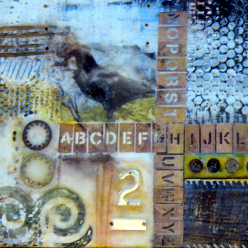
I want these pages to feel sort of messy and chaotic, to go with the creative energy and excitement that was part of ArtFest-- hopefully I've captured it with the colors and patterns of the papers I chose to use. (but still have the photos, not all the other "stuff" be the focus-- it's a fine line!) I also added in some hand-done elements, like the "scribbled" circles (a new sparkly pink gel pen) on the background, and the dotted line on the border (pink acrylic paint pen). This is a way I can start to "blend" my art journaling artistic sense with my scrapbooking pages, too, hopefully. I'm not totally "in love" with this layout, but at least it's done and I'm on my way. I'm trying to work on letting go of my perfectionist tendencies, but it is hard: I especially don't love the title stickers (I think they're too small for the page design) but I don't want to go out and buy new ones just because these aren't "totally perfect" for it... (baby steps, right?? lol!!)

Below are a couple detail shots of the layout:

the flower is felt, for a bit of texture, and the edge on the purple paper was made with my new favorite border punch- lol; I only have two border punches total, but I really do like this one! The pattern it makes is like notebook paper ripped out of the spiral binding. It is this punch, which you can get at most local craft stores. (and they're not priced too bad, with a 40% off coupon, either!)

this is a detail shot of the focal point photo, which isn't a "great" photo or anything, but it's one I wanted on my page because it shows where I went. It's a photo of a map of the Olympic Penninsula; I used two circle punches to make the ring around Fort Worden, which is where the ArtFest retreat is held every year. The chipboard arrow (by the way, the shade of red doesn't quite "match" either, but I'm okay with that... lol-- I told you my perfectionism was bad!) is from a set of chipboard shapes I got at the local scrapbook store off the clearance table. Look for more arrows and circles coming soon, so I can use them up- lol! But, I do like a bit of chipboard, etc. to add a small amount of dimension to my pages. (I still want to be able to put my pages in page protectors when they're finished.)

So, stay tuned for more scrapbook pages coming soon, because I am spending Saturday the 28th at the Phoenix Scrapbook Cottage... yay!!