July 30, 2012

art journaling, a personal historical perspective... part 1

My Art Journaling Journey to date: A Retrospective- Part 1... (lol!!)
(photo heavy post)

This post is a bit of a 'walk down memory lane' about how I got started in art journaling. Where did this come from, you might ask? Well, I took one of my journals to work with me last week where I got some mixed reactions: a few strange looks, a few interested ones, and a couple 'hey, that's really cool!' comments. So, I thought I'd take a look back at where I came from art-wise, and how it came to be that a 43-year old woman would bring gelly roll pens to work so she could doodle during her break! Let's see if I can connect the dots (pun intended- lol!), shall we?

From a journaling sense, I've always loved notebooks and school supplies, and I think I tried keeping a diary off and on, as most adolescents do... I'd find a cool notebook, write a dorky-sounding entry or two in it, then abandon it. My grandmother kept a journal / diary as long as I could remember, and I had always found it fascinating to see what she had written; it was neat to go back and read things like the entry that said she was watching my brother and sister because my mom was at the hospital waiting to deliver my other sister!! Even with that, I never kept up with my own journaling. 

Fast forward to my mid-30s during my treatment for depression, where my counselor suggested journaling.  So I picked it up again using regular spiral notebooks. It was therapeutic, but writing in long-hand is slow, so while I was writing I would get 'out of the moment' and start to think too much about what I was writing (if you know what I mean), and it would get awkward again. After doing this for a couple years I wrote more sporadically, then finally quit altogether.


Artistically, I started out doing card-making with rubber stamps, then moved into traditional scrapbooking using photos, and dabbled in other things like making Artist Trading cards (2.5x3.5 inches) and inchies (1x1 inch pieces of artwork). After I moved to Phoenix, I realized I could attend Art Unraveled, a week-long art event that includes workshops on all sorts of things, taught by instructors from all over the country.That year (2007) I took three classes); one of them was called 'Off the Wall' and was taught by Kelly Kilmer. (little did I know that this class would basically change my life, and what I thought about journaling! and I'm being totally serious about that... lol!) 


I remember some aspects of the class quite vividly... some people brought their journals to work in, but for those of us who didn't have one, Kelly handed out large sheets of paper to work on (like, 20x30 inches large). I remember being scared to death of that paper!!! seriously! LOL! I had never worked on anything larger than a 4.25 x 5.5 inch card, or at the most, a 12x12 scrapbook page! She suggested tearing it into smaller pieces and starting with that. (I was concerned that since I didn't have a paper cutter, it wouldn't be straight-- LOL again: I needed some loosening up, didn't I?!?) 

Anyway, this is one of the pages I made in that class: the techniques taught (I think) were how the paint fades from dark to light across the page, and the placement of the collage elements that draw your eye across the page. I like this page alot since it's one of my first efforts, and I have it hanging up in my craft room.


This page is another reminder of one of the other things I remember very vividly about that first class: it's collaged paper, paint, rubber stamps, and other things that create layers, texture, and interest on the page. I remember my overwhelming feeling about starting it was, "what am I supposed to do?" and "what if I do it wrong?" Of course, there is no 'wrong' in any of this process, and you can do anything you want to do, but that's something I (being a perfectionist from way back) hadn't learned yet! This page also stays in my craft room, to remind me of those things.


graffiti-style journal #1
I liked what I did in that class, so when Kelly came to Scottsdale in the fall to teach classes at a local store (Frenzy Stamper), I went back for more. This time, we worked with paint, stenciling, mark-making, and book-making to make two small pamphlet stitched books. Again, these were all things that were very foreign to me at the time, but I was starting to learn that I liked getting messy with paper, paint and glue!! 


graffiti-style journal #2

After that I decided to start my own journal. And no, I didn't use the ones I made in the class; I think I didn't want to 'mess them up' or something... just one of those hang-ups I still had about perfection! Instead, I used a 99-cent composition notebook. Cheap, yes- but in retrospect, I really wouldn't recommend it, especially not for someone just starting out. The pages are extremely thin and because of that they don't take paint well- the paper gets really wet and can warp or even rip. (I was sometimes frustrated that I couldn't get the pages to look as good as I wanted them to, and now I realize that a large part of that was due to the paper.)


Here are the first completed pages in my composition book journal-- they turned out very 'scrapbook-ish' looking in my opinion. At this point, I still hadn't worked out my art journaling style. Plus, pretty much the only supplies I had at that point were acrylic paint, a few metallic pens, and Sharpie markers. (While Sharpie markers have their place, I've found that there are so many fun supplies out there to use, lol!) The other things that's 'scrapbook-ish' about these pages is that the writing is very much 'who, what, where, when' type of writing, much like the matter-of-fact journaling I do on my scrapbook pages. I had to work my way into writing on these pages like I had done in my earlier, written journals.


for me, art journaling sort of encompasses the best of written journaling, but better-- when I get into the flow of a page, making the art on the page (backgrounds, collaged paper, pen detailing, etc) is similar to meditation. 


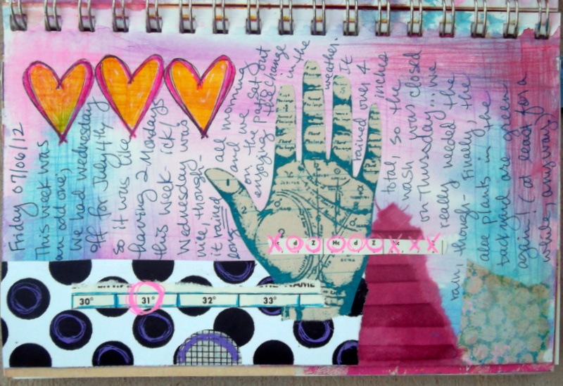
Some pages are more about the words, like this one:

Some pages are purely about getting emotions onto the page, like this one made earlier this spring after I was diagnosed with ovarian cancer: 
To me, there aren't any words needed on this page: the colors, shapes, and feeling of this page captured what I needed it to when I made it.


Some pages have plenty of meditative penwork and doodled details like the details on this one:

Some pages are purely about cutting and gluing pieces of paper (meditative, again) to other pieces of paper, like this one:

 Remember what it was like in kindergarten to use the scissors, paste, and crayons? Who said we have to give that up when we 'grow up,' anyway?? Not me! For me, art journaling isn't about 'making pretty pages' at all (although sometimes they may turn out that way, that's not my goal); it's about using the art as a way to get out my emotions and document my thoughts and emotions in a visual way. (plus, why should school kids get to use all the fun supplies, anyway?!? haha!!)

if you made it this far, thanks for reading the entire thing! I recently realized just how many journals I actually have, so I think they deserve a post of their own, which will be Part 2-- coming soon to a blog near you.   :D


July 26, 2012

5x7 journal pages- finished and unfinished

Finished: watercolor background, collaged paper
(including some Chinese newsprint gotten from someplace
I can't remember), deco tape, and doodling

close-up of the deco tape- dots on the tape
filled in with more dots with gel pens... 


finished: crazy-doodled page.
the main doodles were done with my only
Copic markers (I have a whole two of them!);
the round bubbles were then filled in
with many colors of watercolor paint.

close-up of the details. This page won't be
written on; I really like it the way it is! 


an unfinished horizontal 2-page spread.
A bit of gesso stamping for texture (the circles, done
with a wine cork before the painting), watercolors,
and a bit of random stamping with teal StazOn ink.

July 23, 2012

recent random photos-

some random photos from the last week or so:

a grate (or drain?) in the sidewalk that caught my eye- 
this pattern would make a neat stencil!


election season humor- Salmon Roe, hahaha!!
 Someone named Salmon running for Congress, 
and someone else named Roe running for city council. 
(Somehow I don't think their signs were put next to 
each other by the candidates!)  

amber waves of grain (fields of corn, almost ready to harvest) 
and purple mountains majesty (the Estrella Mountains)... 
on my afternoon commute home from work. 

 doodled details on a journal page- 
paint pens and black permanent ink


more doodles on the same page- 
white and black pen details on gray acrylic paint
(I've been into these 'pod' shapes lately)

an 'Olympic' soda display at the local grocery 
store- these kinds of displays are so neat! 
(I imagine the delivery guys who have to create 
them don't like them quite so much, though...)

July 19, 2012

more pages from the 9x12 journal

are you getting tired of journal pages yet?? lol! I hope not, because I have a few more... and I have photos that I need to get off of my camera, but I haven't gotten around to it- so, till then, journal pages are it!


more pages from my 9x12 journal:

Prayers to Heaven- full page
This page is a watercolored background with collaged paper. Some of the papers used include: an image from a vintage National Geographic magazine; scrapbook paper; photocopied black & white text; green & pink text image from a graphic arts magazine.  The paint texture (look for it in the upper right corner) comes from putting crinkled plastic wrap onto the paint while it's still wet, then letting it dry. 


Closeup of the watercolor texture 
This page is 'done' in the sense that I've written what I want on it, but every once in a while if I land on this page as I flip through the journal, I'll do a bit more doodling on the upper left part of the page


This is a (horizontal) quote page: stenciled watercolor background, teal StazOn stamping (the numbers and the circle design), a bit of paper and tape collage, and a quote by Anais Nin: "We do not grow absolutely, chronologically. We grow sometimes in one dimension, and not in another; unevenly. We grow partially. We are relative. We are mature in one realm, childish in another. The past, present and future mingle and pull ius backward, forward, or fix us in the present. We are made up of layers, cells, and constellations." I wish my writing was neater (straighter, and more 'interesting' looking)-- it's been a long time since penmanship lessons in school!


This page is pretty simple, with a watercolor background and a few papers I wanted to save: a get-well card my mom sent me while I was recuperating from my second surgery, and a couple magazine / newspaper clippings she sent along with the card. (thanks, Mom; I love getting fun mail!)


Another quote page: a watercolored background over gesso that was scraped through a stencil (the squares and rectangles), Sharpie and white pen border. The image is from a magazine, and the quote was written on with a blue Sakura glaze pen. The quote is by John Muir: "Everybody needs beauty as well as bread, places to play in and pray in, where nature may heal and cheer and give strength to the body and soul." I really like this magazine image, and was glad to finally find a page to use it on: it reminds me of summer vacations on the Loon Lake in Minnesota, which are some of my most cherished memories. Memories of the lake, the dock, and loons on the water are the  'happy place' mental images that I use to relax and unwind during times of stress (I don't think about the mosquitoes that I'm sure were there, lol!).

I have been having a good time working in these two journals lately; watercolor paint is such a quick, easy way to get color onto the page! Especially with the low humidity here; it takes practically no time at all for the paint to dry!! (there's got to be something good about summer in Arizona, righ?!?)


July 16, 2012

Journal Pages in the 5x7 journal

pink and purple
an unfinished 2-page spread in my 5x7 journal: watercolors, a bit of stamping with gesso and teal StazOn ink, along with some collaged paper and images. 


hearts and hand 
a one-page horizontal spread in the 5x7 journal. (I have to remember that even though the book is bound vertically, I can still rotate it to make a horizontal page if I want.) Watercolored background with collaged paper. The palmistry hand is a Tim Holtz stamp that I stamped onto vintage paper with teal StazOn (permanent) ink then cut out, and the hearts are stamped on the background then colored in with Sakura glaze pens. I think it might look a bit better if the hand was outlined with a black pen or pencil, but I'm not going to worry about it too much.


An unfinished page in the 5x7 journal. This page was sort of an 'experiment' in ink use. I have a number of stamp pad re-inkers (small bottles of ink that you can use to rejuvenate a stamp pad), and I wanted to see if I could use them to create a page background, similar to using the spray ink or cake watercolors. I saturated the paper with water, then dripped the re-inkers onto the page, to see what would happen. The drops of butterscotch color sort of 'bloomed' into a really cool pattern once they hit the wet paper. The green ink was more of a 'line' that I drew with the dropper tip, then it spread into the water. (I do like how this turned out, but I had to get the paper sooo wet to get it to work that I probably won't be doing this again anytime soon.)

lines and colors
Another unfinished 2-pages in the 5x7 journal. These pages were started out with the black stamping, then I scraped a bit of gesso onto the page (the whitish, lighter spots). Eventually I hit it with the spray inks in a random pattern to create the colored background you see here. (the gesso acts as a sort of resist or the color, so the color isn't as saturated in those spots.)


boy and his dog
A somewhat simpler page than some, with various 'blobs' (do you like that technical term?!? lol!!) of watercolor paint overlapping for the background. The image is a vintage photograph that I bought somewhere, scanned and printed onto regular paper. I wrote around the photograph with a fine-point pen. I really like the contrast of the brightly colored background with the vintage black & white image, and not every page needs lots of layers,  time, or a detailed, polished finish. (not that I don't like doing that sometimes, just not all the time- lol!) 

July 15, 2012

I sense a theme... and some recent weather.

Not really a purposeful theme, but I do have some similar colors, designs, and images that I find myself using in my journals. These pages aren't right next to each other, but in flipping thru my 9x12 journal, these all jumped out at me since they all have similar imagery. 

During my recuperation from the second surgery, I started taking an online journaling class by Kelly Kilmer: Memories and Reflections. It includes collage templates, journaling prompts, printable collage elements, and instructions for making two different handmade books. I haven't made the books yet, but have used some of the templates and collage images. 

everything will work out
This page started with one of Kelly's layout templates, and includes vintage sheet music, painted newsprint, handmade paper, watercolor crayons, and gel pens. The image was out of an antiques magazine. (again, I don't like how my writing turned out, here-- but the page is done, and I like the finished page more than I dislike my handwriting, so it's all good.)


graffiti Buddha
This page didn't start out with any sort of a template; instead, it used one of Michelle Ward's 'Street Team Crusades', which were weekly challenges that could be used as a jumping-off point for a journal page or piece of artwork. This particular challenge was 'Strip Ease' (using strips of paper or fabric and attach to your page). The entire background is strips of all sorts of paper, along with decorative tape. The image is one of Kelly's collage images, a graffiti art Buddha. 

graffiti Buddha close up- penwork detailing
all those strips gave me plenty of room for drawing patterns, doodling, and coloring in the various patterns on the paper and tape.

now, to the weather: yesterday afternoon I got stuck in my car for a while in the WalMart parking lot, waiting for the rain to let up long enough so I could run inside the store. Once I got in, it poured hard for most of the time I was inside (I could hear it on the roof of the store!) Monsoon season is interesting in that it can be pouring rain one place and be perfectly clear somewhere else just a mile or two away. And when it does rain, it can pour so hard that the rain just can't soak in, leading to flooding. This was the scene on the highway on my way home from WalMart:
Four out of the 6 lanes on the highway were flooded right at an underpass, leading to a bit of a traffic jam, as we worked our way past the water. So far, this monsoon season is shaping up to be a good one! (except for the mosquitoes- they're horrible!)

any place worth going
another journal page, except this one is unfinished: the overall page layout is loosely the same as the first page in this post, but once I finish it, that probably won't be so easily seen since the style / colors of the papers are so different. 

and now, I'm off to try out some new supplies I got yesterday while I was out doing errands!! 

Storm clouds journal page (again)

Okay, so I think it's done now... remember this journal page that I posted last week?? the one that I kept messing with, and screwed up? I didn't take a picture of what I did to it- or tried to do, rather- but trust me, it did not look good... so, I had to cover it up! This is the result:

Storm journal page
I covered up my mishap (it's not a mistake, it's an opportunity, right?) with some vintage text paper for clouds, and blended it in around the edges with a soft graphite pencil. I also added some vertical graphite 'rain' lines on both sides, to tie the pencil in with the rest of the page. 

Lots of artists say if you don't like something you're working on, to keep going: add another layer, add another color, etc. and I truly do believe that philosophy: if you keep going, you can usually get past that 'I think it looks icky' phase. (most of the time, anyway; lol!!) 

Actually, I think it might need a bit more shading in the clouds to look 'just right' but I know better than to mess with it again, lol!! (...and I still haven't written the date on there, have I?!? :D   lol!)

I've been working in my journals (the 9x12 and 5x7 spiral-bound ones) quite a lot lately, so I have more pages- both completed and in-process ones- to show you soon... 


July 14, 2012

more random Jerome

More random photos from our day trip to Jerome:


Survey marker V28
We happened upon this marker quite unexpectedly as we were window shopping. (it was imbedded in the sidewalk; it pays to look down as well as in the shop windows, I guess!) It's a geodetic survey markers- these markers are 'objects placed to mark key survey points on the Earth's surface. They are used in geodetic and land surveying. ' (paraphrased definition from Wikipedia)

Survey marker 5153
Then, we happened upon this one two streets away as we walked back to the car- cool!! 


This next photo is  some of the artwork above our table at the restaurant where we had lunch.

Drinking Bird

Mom, do you still have the drinking bird we used to have?? (It used to be stored in one of the kitchen cupboards, as I recall.)


These two photos were taken in the small playground that was smack in the middle of town; there was quite a view of the valley from the swingset!


memories of childhood- mulberries
 I was delighted to stumble onto this tree as we went up the stairs; I haven't seen a mulberry tree, especially with fruit on, since my childhood home back in Illinois! There was one in the empty lot at the end of our street, and I, along with the neighbor kids, spent plenty of time picking mulberries during the late spring. It took an awful lot of these to make a pie (and your fingers would be stained purple for quite a while), but I do remember my mom making at least one pie with them. (the berries tasted just as good as I remembered, too!)


mystery flower
and this one, I took because I have no idea what kind of plant it is... any ideas? (It was planted in a pot, as a standard... it was about 5 feet tall, with these really frilly flowers) It's really pretty, but I know better than to try and grow plants/flowers like this here. I've tried once or twice to grow potted plants, indoors and out, and unless it's a cactus, I kill it very quickly. (Apparently my green thumb didn't move with me to AZ.)

thanks for coming along on my photographic tour!! 

July 12, 2012

a visual tour of Jerome, AZ (selected photos)

Last Saturday, we headed out of the Valley up into the mountains for a drive to the small town of Jerome, AZ, which is generally situated in-between Phoenix and Flagstaff, west of I-17. The town of Jerome is more than a mile above sea level on Cleopatra Hill- on the side of Mingus Mountain, in the Black Hills range.  Since Cleopatra Hill has a 30% grade, more specifically, the town is situated on the side of the hill, with the main three or four streets laid out basically 'above' one another going up the side of the hill. 


The area Native Americans and the Spanish explorers had known there was copper and silver in the area for hundreds of years, but the town of Jerome was founded in the 1880s to house workers of the United Verde Mine. (United Verde was at one time the largest copper mine in the state; it mined over a billion dollars worth of ore throughout its 70-year history.) In the photo below (click the photo to make it larger), the town is left-of-center, below the 'J' on the mountain. (an aside: lots of places in AZ have these letters marking places; not sure how it came about- maybe to help direct the pioneers or travelers, since you can see them from such a distance? hmmm... I'll have to look into that.)
Jerome from a distance

At its peak, Jerome was the fourth largest city in Arizona with a population of over 15,000 people in the 1920s. At the end of the 19th century, the downtown area had three major fires, but each time the buildings were rebuilt. A series of underground fires in the mine tunnels around the year 1920 led to a switch from underground mining to open-pit style mining. (The underground fires burned sulfide ore that was in the area- one of those fires burned for a reported 20 years!)  The price of copper dropped in the 1930s and by the 1950s, all the mines were closed. With the mining industry leaving, the town emptied out and the population was only dropped to 50. The local historical society took over many of the historic buildings, to keep them from being vandalized. 


In the 1960s and 1970s, ‘hippies’ found Jerome, and today its population is just under 500, with a culture of art galleries, wineries, specialty stores, unique B&Bs and lodging, and ‘ghost town’ tourism. We were just up there for the day, and really didn't spend that much time there (it was pretty hot, even up there!) but I would love to go back again when it's cooler-, and wear different shoes (we both wore sandals, so we couldn't do much 'tramping around' looking for interesting- aka rusty and dilapidated- things to photograph). Below are a selection of photographs from the day:

'Showing its Age'
The photo above is one of those dilapidated structures; it's the Jerome Jail, which is (obviously) no longer in use. (I'll give you a bit more information about this jail later on in the post.) 


Through the (kaleidoscope) lens
This photo is of Tom, taken in one of the art shops, through a kaleidoscope- cool, right? The entire store was full of kaleidoscopes of all shapes and sizes; some of them were definitely 'art' in their own right, being made from materials such as exotic woods or stained glass.


Douglas Mansion Mining Museum
This photo was taken from the 'middle' of the streets that make up the town; it's looking east toward the Verde Valley. The mountains off in the distance are the San Francisco Peaks, which are just north of Flagstaff, and contain the highest spot in Arizona (Humphreys Peak, 12,633 ft). The building in the photo is the Douglas mansion, which was built by a local mine owner and now an AZ state park; we didn't realize this so we didn't check it out. As one website put it, 'James Stuart Douglas, the owner of the Little Daisy Mine, wanted an impressive residence to entertain his industrial friends and mining officials;' I think he succeeded quite nicely with the 'impressive' part, don't you?)

'a convergence of the (electrical) Force'
Another shot of the Verde Valley, taken from a street higher up-- I really liked how the electrical lines are all coming together here. (another aside: getting electricity to places like this has got to be pretty complicated, what with all the mountains-- another subject I'd like to know more about!)


sky blue scooter & sidecar
This scooter is just something that caught our eye as we walked along the street. Somehow, I'm guessing this belongs to a local, because I can't imagine it would make the trek up the mountain roads! (--but it's sure cute!!)


Blasted
This was along the sidewalk-- I think it's an example of the rock face where they place the blasting charges... they drill into the rock face, set the explosives, get out of the way, then press the button before the boom!
                                           
LUNCH!
We had lunch in a New Mexican style restaurant named 15.quince. (Quince is the Spanish word for fifteen.) It was really tasty!! And a ton of food; we had to try the salsa and guacamole (of course!), Tom got chili, and we both got entrees. (Pork carnitas burrito, and carnitas with beans and rice.) And the leftovers were just as yummy.


wall o' skulls
The other side of the restaurant was covered with decorated cow skulls and crosses. Alas, I don't think any of them were for sale. 

Jerome Main Street

This is what the shopping district of Jerome looks like today- it was designated a National Historic District in 1967, so they've worked to preserve and restore the historic look of the buildings --which hasn't been easy, due to the fact that there were so many fires and other disasters that struck the town. Remember I said I'd tell you more about the jail?? This next picture should explain what happened to it:

Buildings fall down between Main Street and Hull Street
The jail was just one of the casualties of this particular disaster... in the 1930s, the constant blasting from the open-pit mining operation caused a number of buildings in town to collapse and slide down the hill! The jail slid from Main Street down into the middle of Hull Ave. and stayed there till a bulldozer moved it off the street to where it rests today. (the photo above is part of the Historical Society Mine Museum display; $2 admission and you can learn about the history of the town and the area. It was $2 very well spent, in my opinion!)

Jerome is an interesting little town, and I would love to go back sometime to do some more sightseeing and snoop around for more rusty stuff to photograph. (but later in the fall, when it's cooler!)